skip to main |
skip to sidebar
This blog is a work in progress.
The world of music blogging have become vast and complex in the last few years. While thousands exist, only a few have made a material impact large enough to actually change the face of music. Arguably, the sole front-runner in such a change is Daytrotter.com. The sites daily updates and frequent exclusive live recordings from indie all-stars have made the site a hot ticket.
But perhaps what makes Daytrotter the most famously unique is the earthy and beautiful illustrations of the featured artist that appear on every article and post.  Behind the vast archive of these drawings is artist and graphic designer Shannon Palmer.
First some brief info thanks to Daytrotter:"She spent her high school years drawing pictures of her favorite bands while the ‘cool kids’ were out somewhere drinking beer and making out. In an interesting turnaround, she spent her art school days drinking beer and making out while the ‘cool kids’ were drawing stuff. She spends her days doing graphic design for a local newspaper, her afternoons writing about indie rock and sharing her favorite music on her mp3 blog, and her nights (you guessed it) drawing pictures of bands for daytrotter.com." -http://www.daytrotter.com/aboutLike Illord, Palmer finds a distinctive way to combine an artists sound with their portrait.  Pastels and plaid for calm strumming and splotchy and jutted for louder tunes.
Her work combines the smooth strokes of water color with the realism of graphic design to create a inventive way for art and music to walk hand-in-hand.
The expanse of Palmer's work is astonishing as a quick look through the archive section of Daytrotter presents almost every indie heavy-weight in thier distinct style.  Matched with her signature empty speech or thought bubbles, one can almost feel the artist in detail in front of them as Daytrotter's live recordings play.
While she has other work as a graphic designer I would say her job at Daytrotter means Shannon Palmer has one of the most fun jobs in music journalism.
Here's the advice:
make some tea (with nectar honey and coconut milk), listen to the Six Parts Seven (or think of any band you like), curl up pretending your laptop is a nice book, peep Shannon Palmer's graphical interpretation of the artist of choice, be chilled.
For further studies:
http://www.daytrotter.com/
http://shannon-palmer.com/
http://art.shannon-palmer.com/
I will be profiling designers hopefully every day for the next week. After that it will become "Designer of the Week".
This blog is a work in progress.
It's rare when an artist creates imagery that can come to define an emerging genre of music. You'll remember Blue Note Records distinct style of covers that relayed your eyes to the smooth jazz that lay inside.  The emergence of the covers reinvented the way music could influence design. Soon, the distinct simplicity of the Blue Note covers was popularized and began to transcend genres from rock to pop. When the smoke cleared, it found a home with the ever evolving hip-hop scene. Now, as hip-hop producers begin to enter the realm of electronic leaving the dusty needles behind, a new artist has emerged to put a style to the beats. It's Shanghai's Illlord tha Ques and his crew LCP United. No one knows a lot of biographical info about tha Ques but here's the scoop on his outlet.
Created in 2004 by 3 art directors, the "LCP United" is a crew of artists mainly based between Paris and Tokyo. We use various influences and talents associations to develop exclusive visual experiences through print, motion design and broadcasting.
-http://www.lcp-united.com/about.php
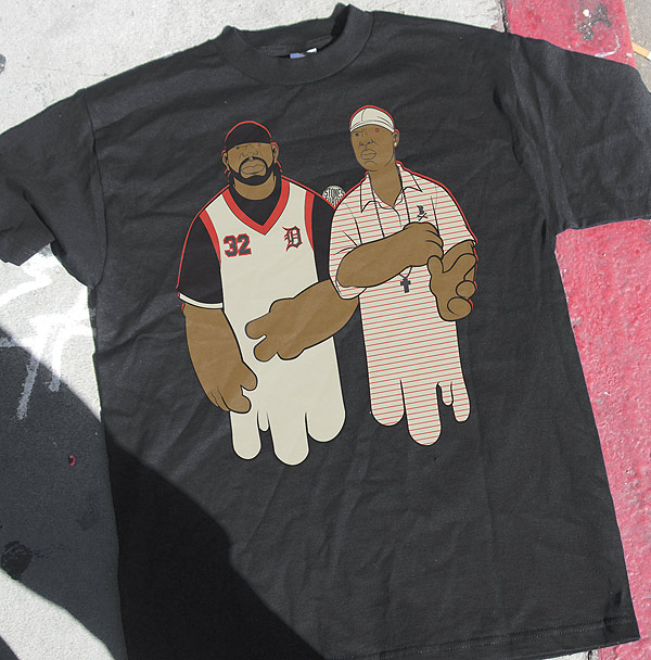
Illord's most popular work is the colorful and curvy caricatures of hip-hop's most influential, forward-thinking and independent producers and MCs.  These portraits are more odes to greatness than comic representations and their combination of bubble graffiti with comic-like fluidity produce a representation that seems to combine the producers physical appearance with his distinct sound and style of production. The producers themselves love it and the and the portraits have begun to show up all over Myspace and tour t-shirts.
While these images are the most familiar from Illlord, his work doesn't stop there. Some of my favorite images come from his Dusty Path series.  Here, Ques illustrates what I can only describe as the Cali-haze style. Disjoint yet smooth, there is a ton to look at up close but the true beauty comes from the image as a whole.
LCP uses these graphics to promote their radio show BTS radio. Small scribbles of reoccurring shout outs build together and grow into a vine-like mountain.
Here's more ish:

 The images are unique and illustrate perfectly the bumpy and beautiful beats of electro-hip hop producers like Flying Lotus and Samiyam.
As these kind of producers emerge onto the scene, Illord picks his favorites and beings to sketch. I imagine making these graphics is similar to the process the beat-makers take themselves.
Start with a scattered array of tools and a creative idea. Before long, a complex brain storm of a blunted mind flows into a piece of art with a unique style.
So definite ups to Illord tha Ques and the whole LCP United for giving this new style of hip-hop a face.
Heres the advice: spark the blunt, put on Lotus' "1983", peep the man's whole portfolio on the LCP site.
For further studies:
http://www.myspace.com/illlord
http://www.lcp-united.com/
http://www.myspace.com/flyinglotus
http://www.myspace.com/samiyambeats
http://www.myspace.com/beatdimensions
http://www.myspace.com/fromlawithlove
thanks-hit me up with more info/questions on Illlord
-Justin

